If C# is versatile it is partly because it housed in an integrated development environment (IDE) that supports it, and if maintaining both the beauty, consistency and accessibility of a language like C# requires expert stewardship, then designing and maintaining a productive UX to support that may actually be an order of magnitude harder.
Visual Studio has long been the IDE of the enterprise, but in recent years it is abundantly clear that Microsoft is actively going after solo developers, students, startups and the open source community. At first the strategy just seemed to resolve to make as many low hanging services free or as close to free as possible. Immediately following that approach we saw the introduction of Visual Studio Code as light weight IDE free of historical UX constraints, a light weight app for both Windows and Mac audiences.
As I have said in the past Visual Studio changes are the most obvious way to predict Microsoft’s direction and emphasis for our stack for the next few years. I believe we are starting to see Visual Studio 2017 adopt important UX strategies that look to make the entire family of developer products more accessible to everyone.
Installation improvements
The initial VS download is just about 1MB which is fast but what I really like is that the installation presents better categories for the types of workload a developer might be interested in executing. While you did get a list of components in previous install versions it was not nearly as obvious what your were installing and why, this simple categorization helps someone new to this process quickly align the install to their interests.
The Individual components folder still maintains a more granular list of components that the more experienced among us can install.
Learning the Fundamentals
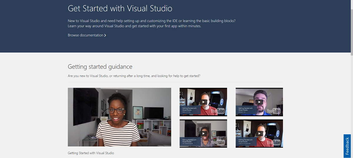
I am assuming the home page will change as we move to a full release but what is currently clear is that the emphasis is on developers who know nothing about Visual Studio. Previous iterations of Visual Studio (2012, 2013 especially) seemed to only be concerned with the differences between versions, which for a new developer is assuming an awful lot.
Not sure if this purposeful but thought it was worth noting how these intro videos were done from the home of developers, a subtle and more accessible look to learning. I have been using Visual Studio and the .NET stack for so long I take for granted that there is so much to learn in the IDE. This is ultimately more useful than showing me the three new features I probably will not use anyway.
Going a step further
Unfortunately this looks to be where we these UX improvements stopped, I would love to see this taken a step further. Take, for comparison, Photoshop which itself has years of justified but sometimes complex interfaces, but has found better ways to present options to end users without overwhelming them with menus, tabs and docking windows:
The strategy Photoshop employed was a simple set of buttons button that informed your IDE what you intended to do. Did you just need the Essentials? Are you into 3D manipulation? Editing Photos? A simple click placed the most obvious windows and menus within immediate reach. I think Visual Studio could, especially with the massive amount telemetry data it collects, make a great case for defining a set of items that need to be immediately available when working on the Web or Unity or whatever.


Comments are closed.